Dentis
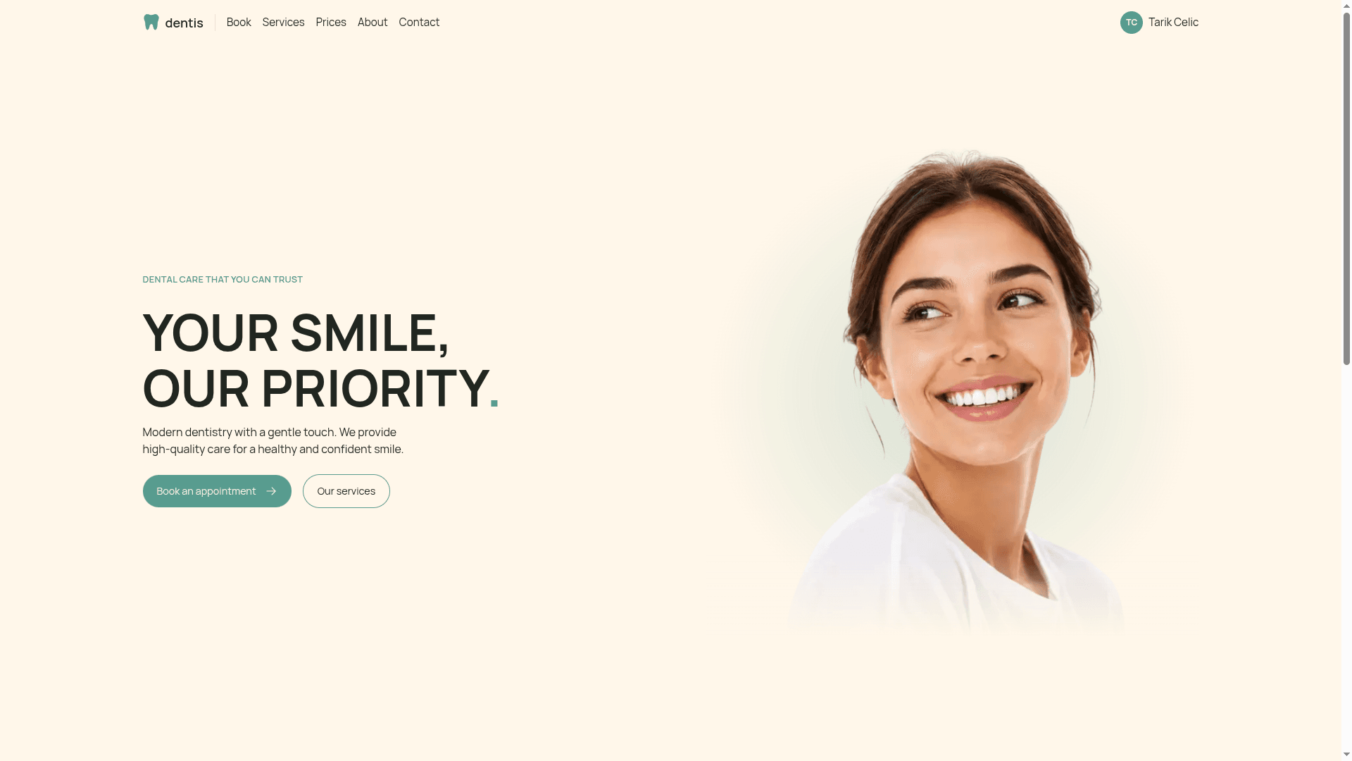
A dental clinic web app: pick a service, a doctor and a time, then share your health details with the clinic before you even arrive.
- Year
- 2026
- Role
- Solo project: design, frontend, backend and database
- Platforms
- Web
Overview
Dentis is a booking and patient portal for a fictional dental clinic. A patient chooses a service, a doctor and a time in three steps, and keeps their health information in one account so the doctor already knows them when they walk in.
From first click to booked
Pick a service
See the duration and price
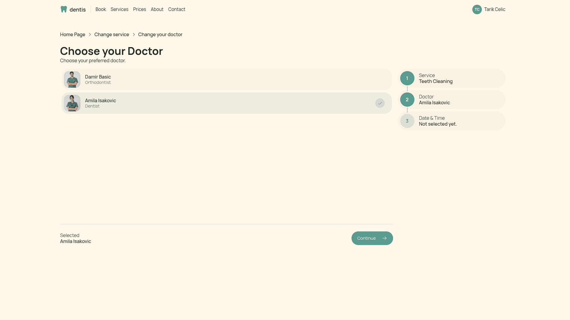
Choose a doctor
Only doctors who offer it
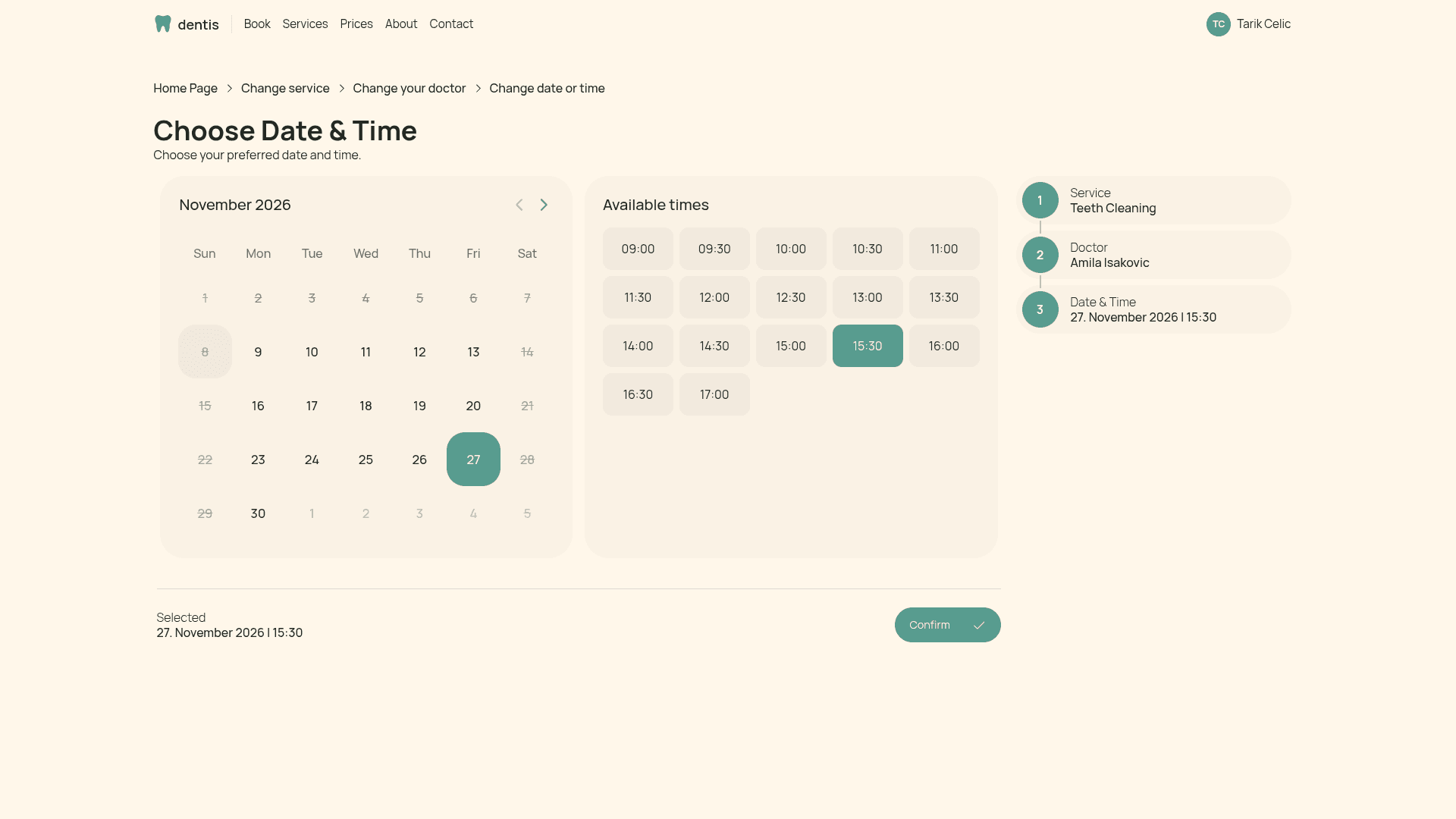
Date and time
Open days and free slots
Server checks it
Rules and overlaps
Appointment saved
Starts as processing
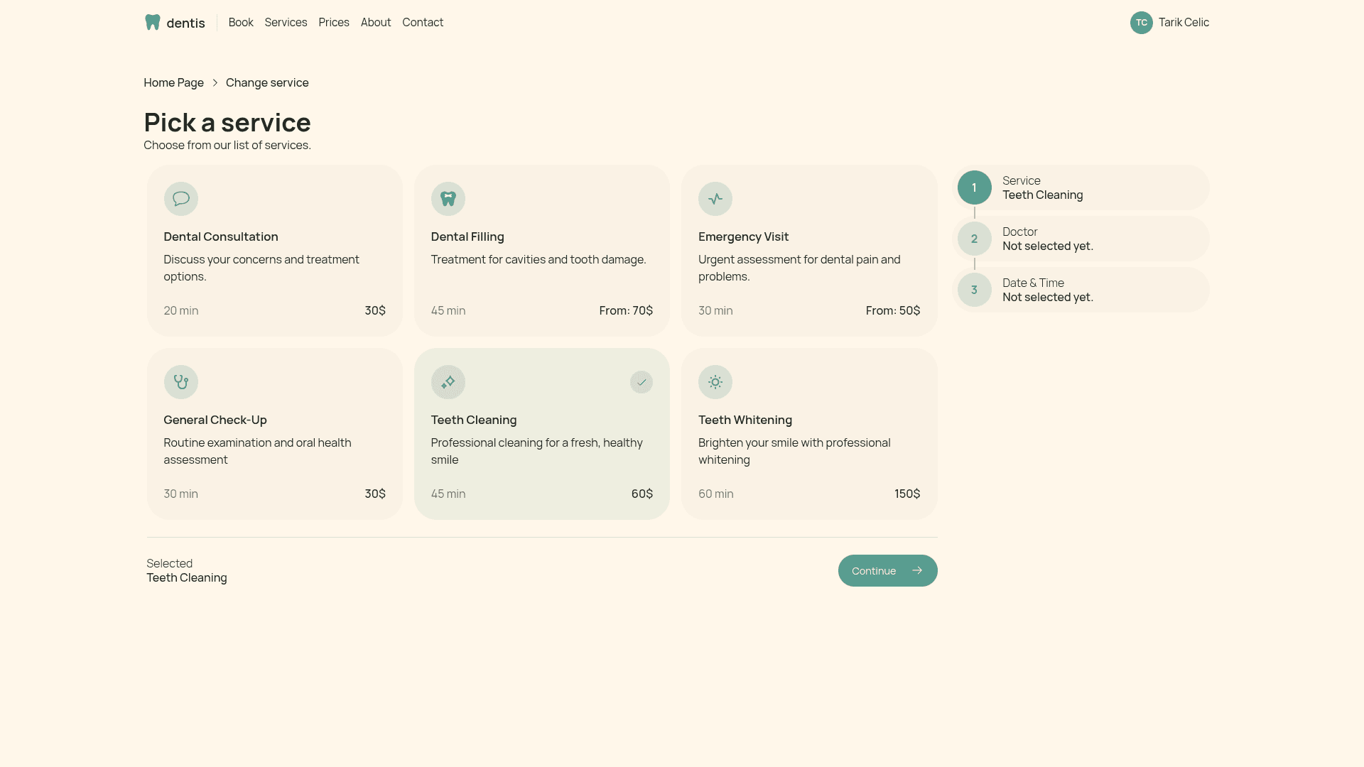
Pick what you need, see what it takes
Every service shows how long it lasts and what it costs. A side summary follows the patient through all three steps, so they always know what they have chosen so far.
- Six services, each with duration and price
- "From" prices for treatments that depend on the case
- The duration decides how much of the doctor's day the visit takes
The best appointment is the one where the doctor already knows you. Dentis lets patients share their health details before the visit, not at the front desk.
Who uses it
Patient
- Chooses a service, a doctor and a time
- Cancels an appointment when plans change
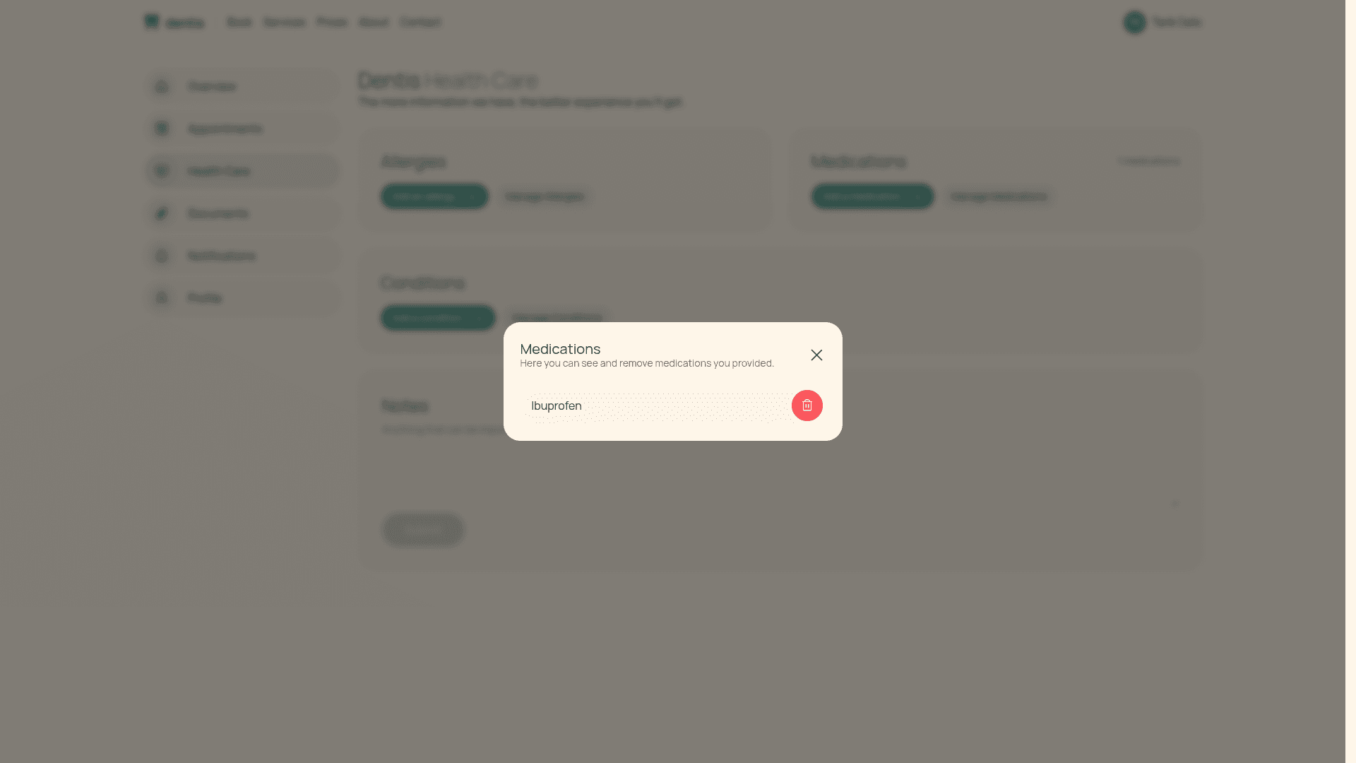
- Fills in allergies, medications, conditions and notes
- Keeps appointments and health info in one account
Doctor
- Has their own account type, separate from patients
- Offers a chosen set of services
- Receives the appointments booked with them
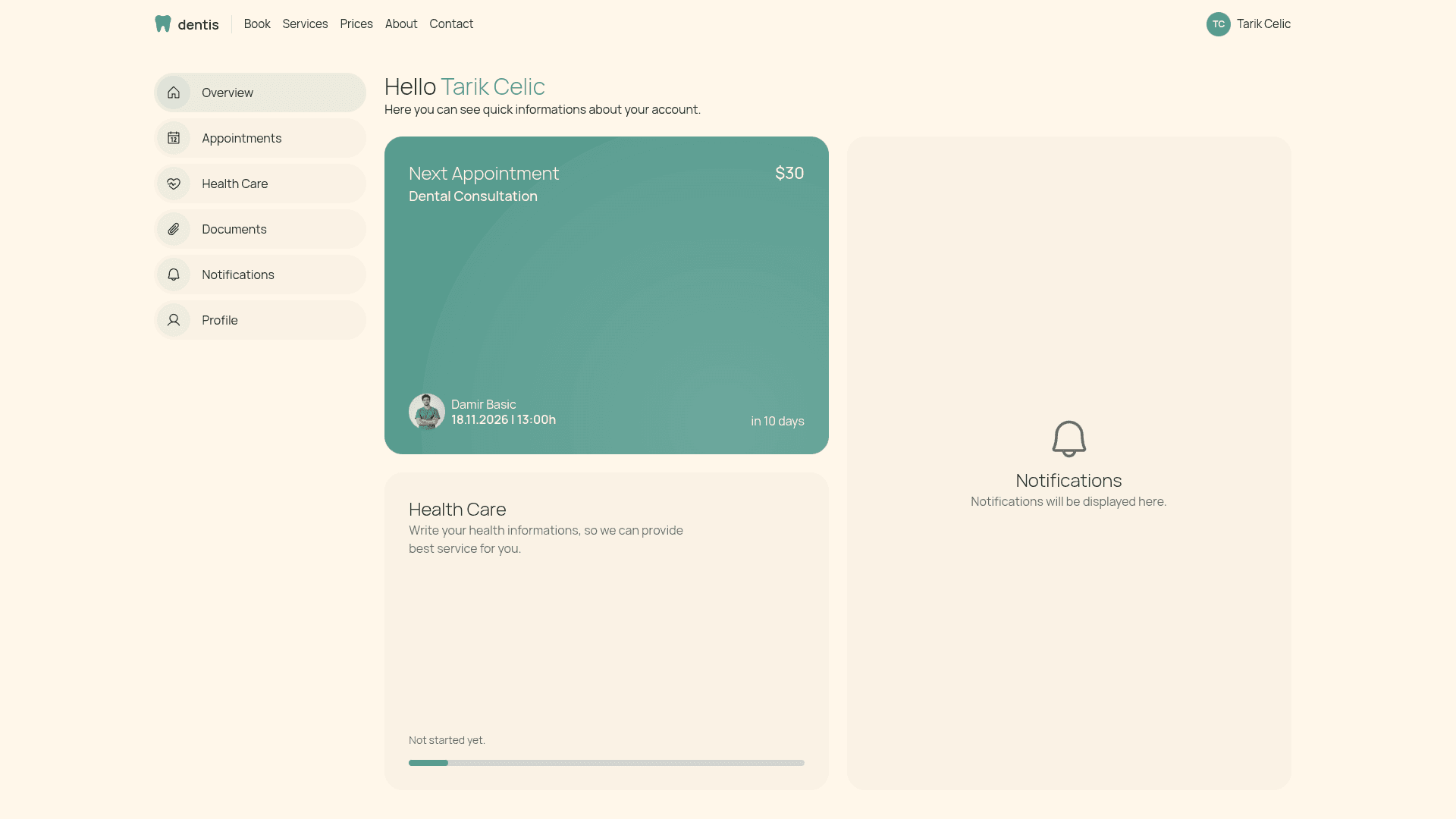
Your whole visit in one overview
The account opens with what matters most: the next appointment, how complete the health profile is, and a place for notifications.
- Next appointment with doctor, date and countdown
- Health Care card with a progress bar
- Quick links to appointments, documents and profile
Under the hood
Time as minutes
A time is stored as minutes from midnight, so 540 is 09:00. A date is a plain string like 2026-11-27, which keeps time zones out of the way.
The server has the last word
Only logged-in patients can book, only on weekdays between 09:00 and 18:00, and never today or in the past. The interface hides bad options, the server refuses them.
Price is copied
An appointment keeps its own copy of the price at the moment of booking, so changing a service later never rewrites an old visit.
Health profile in sections
Allergies, medications and conditions are lists, with notes on top. Each section can be marked complete, and that is what fills the progress bar.
Challenges
Two appointments must never overlap for the same doctor, even when a 45 minute visit meets a 30 minute slot.
Every appointment stores its start and end in minutes. Before saving, the server looks for any active appointment of that doctor on that day that starts before the new one ends and ends after it starts. Cancelled ones do not count.
Patients, doctors, services and appointments all depend on each other, and the first model I drew did not hold up.
A user can be a patient account or a doctor account, doctors are linked to the services they offer, and an appointment ties patient, doctor and service together.
Dates and times are easy to get wrong, especially around time zones and weekdays.
I stopped passing Date objects around. The date travels as a string and the time as minutes, and the Date object is only used for the weekday check.
How I built it
Next.js + TypeScript
Interface and server actions in one codebase, with the booking rules living on the server.
Prisma + PostgreSQL
Patients, doctors, services, appointments and health profiles with clear relations and indexes.
Better Auth
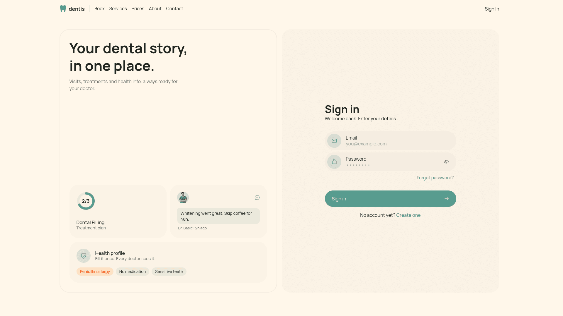
Registration and login, with patient and doctor accounts built on top of the user.
HeroUI
Accessible components for the basics, so the time went into the custom look.
Motion
Small animations that make the fully rounded interface feel alive.
Look and feel
Dentis is designed straight in code, set in Manrope. Green is the colour most people connect with dentistry, and a warm cream replaces plain white because it is simply nicer to look at. Everything is fully rounded, in the iOS spirit, to make a dental visit feel less clinical.
Next up
- Patients upload their own documents, like old X-rays, before the first visit
- Doctors attach files to an appointment after it is finished
- Doctors leave short comments on an appointment, like a note, not a live chat
Screens
What I learned
Time is just numbers
Minutes from midnight made overlaps a simple comparison, and I finally understand how the Date object behaves.
Let the server decide
Hiding a bad option in the interface is a courtesy. Refusing it on the server is the actual rule.
Understand it, don't just use it
Prisma, React and TypeScript details I used to follow along with are now things I can explain on my own.